Maisonette Inc.
A baby and children’s digital marketplace headquartered in Brooklyn, NY focused on becoming the one-stop-shop for baby and kid’s products
Scope:
Marketing asset creation for mobile and web, homepage redesign, UX/UI design, seasonal landing page redesign
Marketing Assets
Creation of marketing assets for Maisonette’s website + mobile app in accordance with the brand design system utilizing shoot and product imagery and Adobe Creative Suite


Homepage Redesign (UX/UI Design)
Task: As part of the Site Marketing team at Maisonette, I was tasked to redesign the e-commerce site’s homepage in 1 week in accordance with results from an internal usability case study. I took into account the key points from the study as well as performed competitor analysis and looked into overall CTRs of each module to develop a new design (wireframe, asset placement strategy)
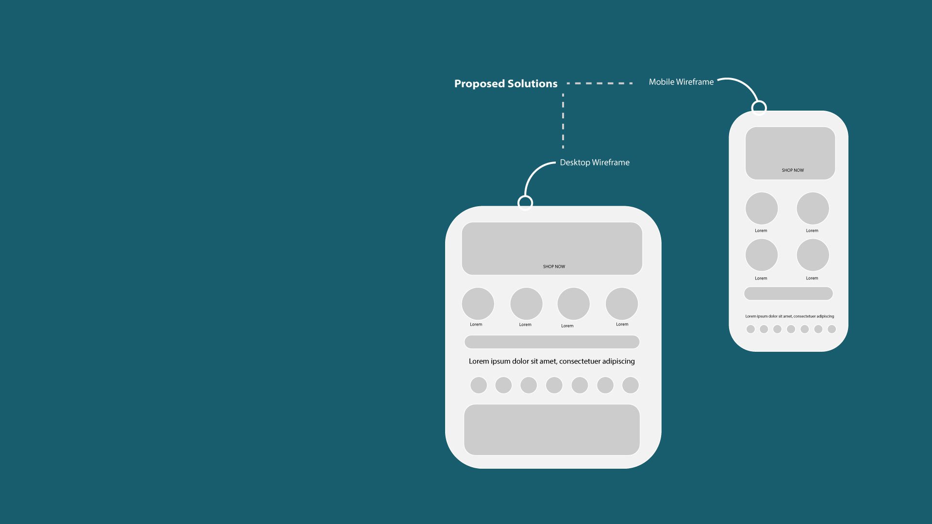
Outcome: I compiled the major data points and collaborated with the UX Design Manager to incorporate UX/UI best practices to develop a new HP wireframe that shortened the page by over 50% and resulted in a 16% reduction in bounce rate upon release ( old vs. new layout below).
Key Pain Points + Proposed Solutions:
(Key pain points compiled from the usability study, competitor analysis + site analytics)
The lack of boy products and representation on the HP
Incorporated a new asset placement strategy that consists of at least 1 boy represented in lifestyle imagery in the hero and top 4 edit circles.
Low scroll depth - Consumers only scroll to the hero and the top 4 edit circles
Asset placement strategy that focuses on new drops and seasonal top-selling shops in the hero and top 4 edit circles. The highest CTRs of modules on the HP were the hero and top 4 edit circles as well further indicating the importance of these modules.
Consumers are not aware that the page scrolls due to the hero being the full height of the screen before the fold
Reduced the height of HP hero assets so that the content modules below would show to encourage users to scroll.
Consumers would scroll to the bottom of the page to find the 16 circles which displayed product offerings
Removed the 16 shop circles at the bottom of the page and introduced a new module higher on the page with the top 8 shops(icons) which would remain evergreen and display product diversity.
Most consumers did not interact with the 6 carousels on HP
Removed all carousels and introduced one What’s New carousel to display new offerings on site. What’s New carousels were also common amongst other similar e-commerce sites (Amazon, Revolve, Wayfair, Target).


Consumer-Centric Design
Seasonal Landing Pages(LP):
As a seasonally driven e-commerce business, I was tasked to redesign seasonal shoppable landing pages(Halloween, Christmas, Holiday, Easter, Mother’s Day, Swim Shop) each year. From analyzing user behavior through CTR, competitor analysis, and product drops from the Merchandising team, I developed consumer-centric designs which resulted in higher yields YOY
Narvar Tracking Portal:
Narvar is the consumer-facing order tracking page and is one of the most visited pages post-purchase. In order to entice newly converted and habitual customers to shop and download our app, the tracking page was redesigned with the user in mind. Modules were added to showcase new sales, what’s new, private label brand, new mobile app, and order status. By utilizing competitor analysis and user behavior, we were able to create an experience that draws users back into the customer funnel.
